

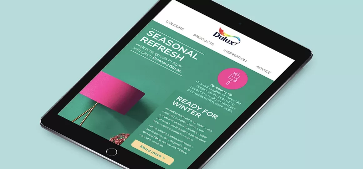
The Dulux Social team tasked Red C with creating an email promoting the popular Emerald Glade colour, which was performing strongly. The project was a first – never before had Dulux put out an email focusing solely on one colour.
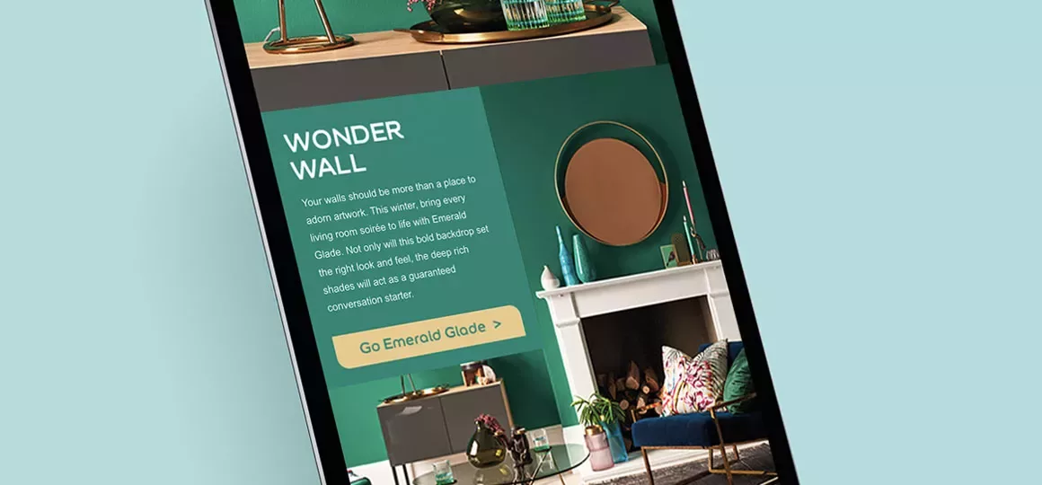
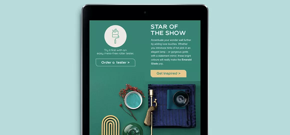
As you might expect, Dulux has a wealth of beautiful imagery it can draw on for its marketing materials. We decided to use shots that would speak to the reader, telling them exactly how they could use Emerald Glade to bring a room in their house to life.
We also made a decision early on to test two creative layouts – a fluid ‘all green’ version and a more structured ‘white block’ one. Email is a medium that’s most effective when it communicates quickly. So, finding a layout that guides the eye seamlessly is important.
Copy-wise, we adopted an editorial tone to match the Dulux retail magazine, Let’s Colour. We titled the email, Seasonal Refresh to suggest something that was both topical and easy to achieve.
Overall, the emails generated an 18% open rate and a 12% click-to-open rate. However, the structured ‘white block’ layout performed better in terms of click-to-opens. We had a positive response from the client, too. Ewa Moxham, Dulux Creative Lead had this to say:
“I’m loving today’s email… gorgeous imagery, great ‘Dulux way’ copy and a simple, single-minded focus on the colour. Well done to all involved.”